Case Study: STEMChests
Creating accessible science kits for elementary schoolers.
OVERVIEW: Branding and product design I made for my non-profit, STEMChests. The non-profit model revolved around selling affordable, low-cost science kits and using all profits to donate more kits to students in underprivileged communities. In the course of a year, we managed to go from zero name recognition or customer base to over $3,600 crowdfunded online/in-person and over 1000 kits distributed. We currently have an in-person conversion rate of 37%.
- How do I create a trusted brand that can earn both sales and donations?
- How do I create a recognizable and appealing physical product that can be easily handmade on a low budget?
- How do I ensure that my product is accessible for young elementary school students?
TIMELINE: Feb 2022 - Aug 2023
TEAM: Aditya Das (just me)
ROLE: Founder
TOOLS: Adobe Suite, Procreate, Shopify/Sanity
SKILLS: Product Design, Branding, Identity, UX/UI

01: USERS
Understanding Our Consumers
In order to streamline our branding and our product, I considered the target buyers/donors. Buyers would typically be middle-aged parents that are trying to find ways to help their child engage with STEM through interactive projects. For this buyer, the charitable cause is icing on the cake, while the low-cost and appealing brand are the main selling points ($10 for a science kit? And the profits go to charity? Of course!). They would typically buy these kits in-person.
Donors would typically be teachers or parents that are passionate/involved with community service and care about equitable education. After conducting more and more workshop sessions, they typically would also be people who had kids that were too old to use the kits themselves. They would typically donate online., which meant that I would need to tailor a website for that specific use.


As we continued to host more workshop events, I continued to get a better understanding of how to best present our product to families and donors alike.
02: PACKAGING
Designing The Box
So, how do we design a box to appeal to children and parents alike?
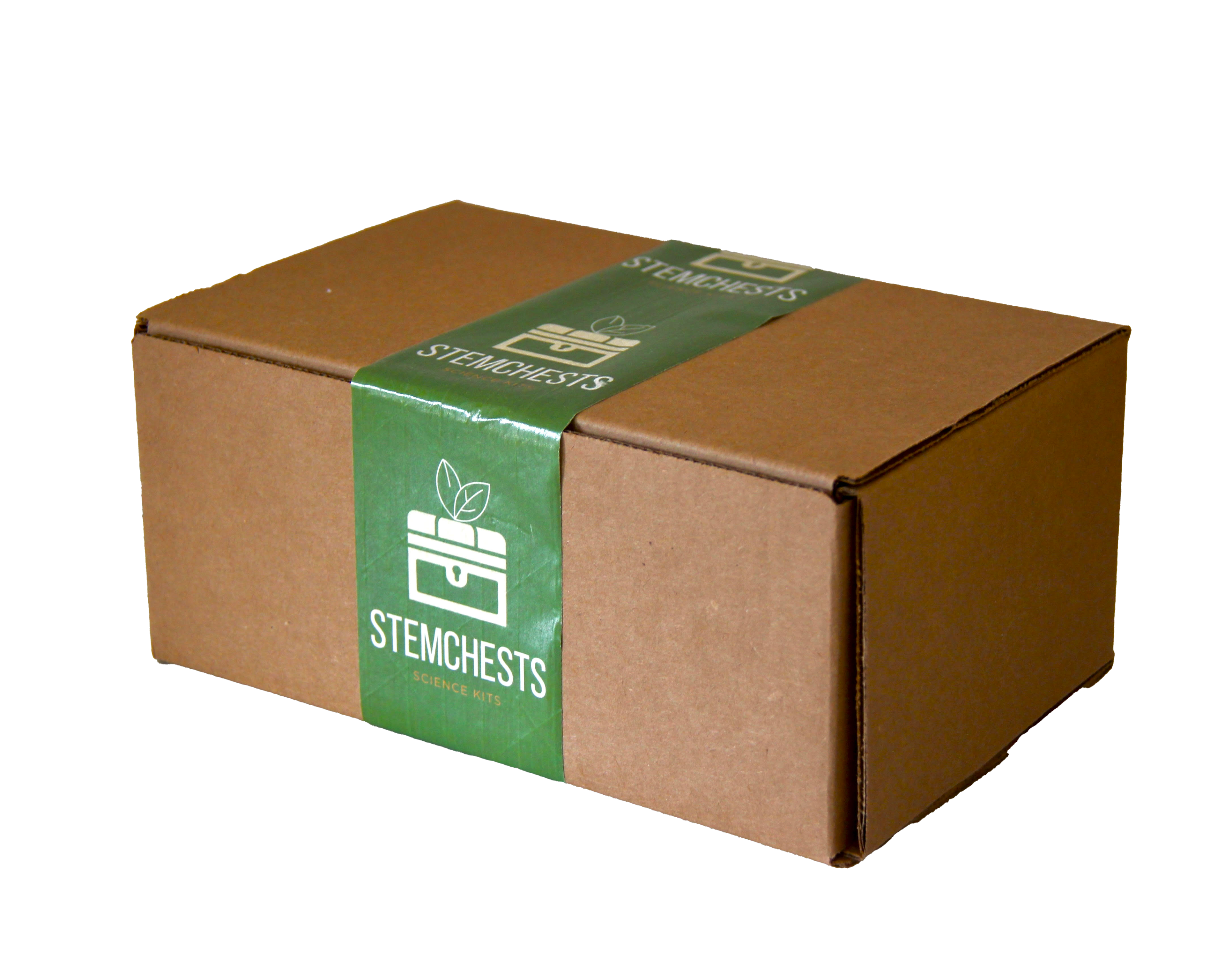
We needed packaging for the box to cost less than $1. The lower the cost, the better.
The biggest two constraints for designing the boxes were an extremely tight budget constraint (we wanted our product to cost less than $5 total for both the box itself and the parts inside, meaning that the box and any decorations would have to cost less than $1) and the need for us to make every single product by hand (a.k.a. no factories). With both of these extreme constraints, I opted for a simple (and cheap) design that emphasized the handmade quality of the boxes. Taking inspiration from Amazon's effective packaging and the unintentional green-brown color harmony between our STEMChests logo logo and the box, I was able to create an easily recognizable product exterior that cost only $.43!
Instruction Booklets
We also strived to make our kits accessible to all students regardless of background or age. We wanted young students to be able to use the kits on their own, which led to a lot of consulting with elementary school science teachers, toy store owners, and families to create a product and brand that would be appealing and understandable by children. Overall, this resulted in big font sizes, detailed and clear illustrations, and very easy-to-follow instructions. This took a lot of revision, consulting with teachers and toy makers, and testing with families to get right.


The instruction booklet for the "Balloon Car" project.
We needed children from ages 5-10 to understand the kits with little to no help from adults.

TESTING
After this, I gave 25 "test boxes" to families from various different backgrounds and asked them to provide feedback for the kit, which helped me assess user pain points and helped me make some finishing touches to the instruction booklets and product to make it more accessible. In the end, this came down to small re-illustrations and wording tweaks.
03: Logo Design
Logo & Branding
STEMChests started from nothing, and my goal was to create a brand that would be instantly trustworthy. Since we were a team high school students who carefully assembled each kit by hand, I decided to give our products a more "hand-made", less corporate feel. I incorporated various illustrations, vibrant colors, and playful (yet legible) fonts to represent our non-profit.


Our logo in action!
04: USER EXPERIENCE AND INTERFACE
The Website
Since STEMChests did not have nearly enough name recognition or platform to attract buyers online, I structured the website to primarily provide legitimacy for donors and potential partners, rather than function as an e-commerce website. Since I was using a free Shopify web theme, I was severely limited in terms of web design and layout. However, through the color palette and text, I was able to still have the final product synergize with the STEMChests branding. You can find the current STEMChests website here.


05: TAKEAWAYS
What I Learned

Balancing Viewpoints
After receiving feedback from (quite literally) hundreds of people, I realized that many people's feedback would conflict. This project taught me how to take in and balance reviews from students, parents, and teachers alike, and try to reach a solution that made the most amount of people happy.

Start Small
Since I was building a non-profit from the ground up, I struggled at first to figure out how to even begin branding the product. I learned the hard way that at first, I needed a minimum viable product, and then to slowly scale up as the scale of my non-profit expanded.
Wording Is Crucial
Between consulting with families and science teachers in order to write instruction booklets for students, and condensing the STEMChests pitch into the most concise and clear version over time, I found that wording can sometimes matter more than visual appeal.
SUCCESS!
A few months ago, a customer came up to me at a workshop event and told me that they remembered me selling them a science kit a year before and that she recognized us from the boxes. It made me proud that I had created branding unique enough to be remembered for over a year, at least by one person :)
Next Project →