Project: Popcorn* Magazine
Designing a youthful magazine in three dimensions.
OVERVIEW: Student work for my ART 132: Introduction to Graphic Design class. The project was the second half of an assignment to rebrand a public space in New Haven, CT. I chose the now-extinct Criterion Cinemas in New Haven, an indie movie theater that was bought by Bow Tie Cinemas at the turn of the century, before eventually being shut down. My goal was to revitalize the branding of an obsolete movie theater so that it could appeal to younger generations of movie-goers, many of which have found a newfound love for movies. Read a bit more in my Criterion Cinemas Rebranding write-up.
- How do I create a youthful magazine that reflects a "new beginning" for Criterion Cinemas?
- How do I create a unique publication layout that would still be accessible for readers?
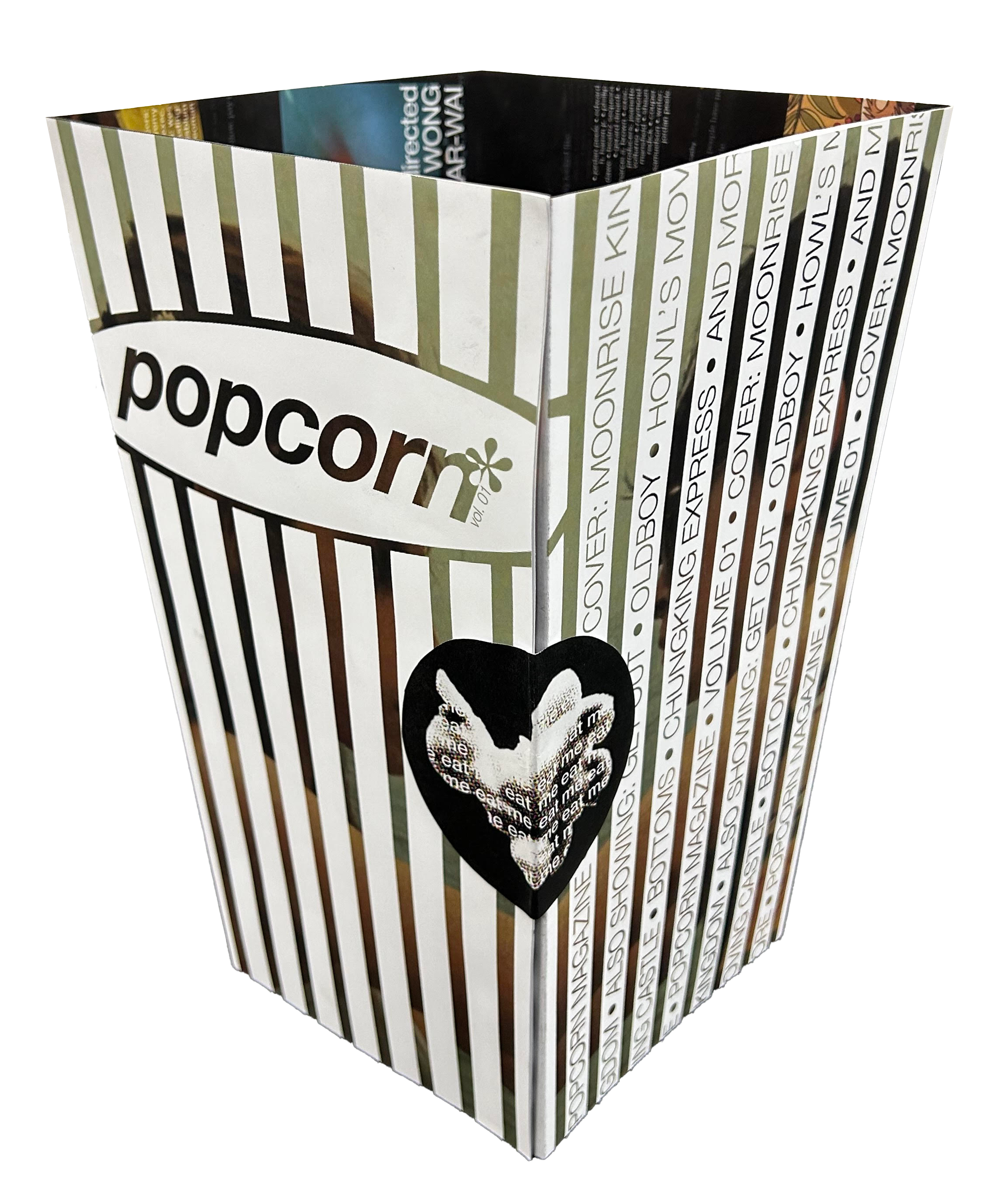
The final product is a magazine presented in a "popcorn box" format that people can unfold to read!
TIMELINE: Oct 2023 - Nov 2023
TEAM: Aditya Das (just me)
ROLE: Designer
TOOLS: Adobe Suite, Figma
SKILLS: Publication, Graphic Design
01: IDEATION
From the very get-go, I knew I wanted this magazine to appeal to younger generations. After all, magazines have had a resurgence in popularity amongst the youth alongside other "retro items" like digital cameras.
When brainstorming different layouts for this project, I found that many youthful magazines have a very "gimmicky" quality to them. One of the best successful examples of a gimmicky cover creating an unmistakable magazine "brand" is i-D Magazine, which matches the youthful quality I wanted to acheive with my magazine.
So, what kind of fun magazine could I make for Criterion Cinemas?
02: THE MAGAZINE
This idea resonated with me for 3 reasons:
- It's instantly recognizable. What other magazine is presented as a three-dimensional popcorn box?
- It straddles the boundary between modern and retro that us Gen-Z kids love best. The red and white popcorn box is an icon reminiscent "golden age of cinema", but very few theaters still serve popcorn in these kind of boxes (if you don't believe me, go to your local Regal or AMC).
- When unfolded, it creates a large spread that almost looks like an arc. This drives home the magazine's goal to "break the mold": it doesn't give into a standard rectangular layout, but rather folds into something more promising!
So how does this magazine work?
03: THE EXTERIOR
When first presented, the magazine will be shaped as a popcorn box! The exteriors are all screencaps from Moonrise Kingdom. A sticker of a popcorn image (with a repeated caption of "eat me") holds the magazine together. The sticker can only be peeled off once, the same way popcorn can only be eaten once, fitting into theme.
04: THE STICKER
To take off the sticker and open the magazine, the magazine has to be collapsed in order to open the flap. The orientation is made clear by the screencaps, which piece together to create one full shot on the magazine. The "info" text then hints at the reader to rotate the magazine 90 degrees to open.
05: GUIDING THE USER
As the reader begins to unfold the magazine, they are faced with their first layout, which showcases the major feature film of the week (for this "volume", it was Moonrise Kingdom) alongside the list of all movies screening in the theater that week.
06: THE FULL SPREAD
When the reader finishes opening up the full magazine, they are greeted with a massive spread of all of the movies. There is very little emphasis on actual small text, as I wanted the screencaps to do most of the "advertising" and entice the reader to visit the theater to watch them.
Overlaid on top of these movies are Letterboxd (a site/app beloved by the younger movie-watching crowds) reviews of each movie. From personal experience, most Gen-Z students watch movies through word of mouth or online reviews, and so I wanted to reflect that within the spread! Adding these reviews allowed me to create subtle visual barriers between each "movie section" while also adding more humor to the magazine.
07: FINAL TOUCHPOINTS
The magazine can be folded in on itself to become easily portable. Or, if you're a collector and want to keep multiple editions of the magazine, you can stack the unopened magazines on top of each other!
Next Project →


