Case Study: Cimu Onboarding
Designing a friendly design system and onboarding process for older, LEP users.
OVERVIEW: Cimu is a start-up business based in New Haven, CT that aims to help online fashion retailers improve sales and reduce waste by connecting shoppers with local tailors.
I was contracted to design their tailor-facing app, which will allow tailors to view and connect to customers. I was specifically in charge of creating a scalable and robust design system for the mobile app and building a simple, quick, and friendly onboarding system.
- How do I create an onboarding system that is friendly and accessible for older users with limited English proficiency?
- How do I create a design system that is accessible, aesthetic, and unique?
I worked in a team consisting of both the CEO and the lead developer of Cimu, along with two other contracted UX designers.
TIMELINE: Nov 2023 - Dec 2023
TEAM: Aditya Das, Alana Tiu, Martin Vakoč, Kaci Xie, Zepto
ROLE: Product Designer
TOOLS: Figma
SKILLS: Product Design, Rapid Prototyping, UX/UI
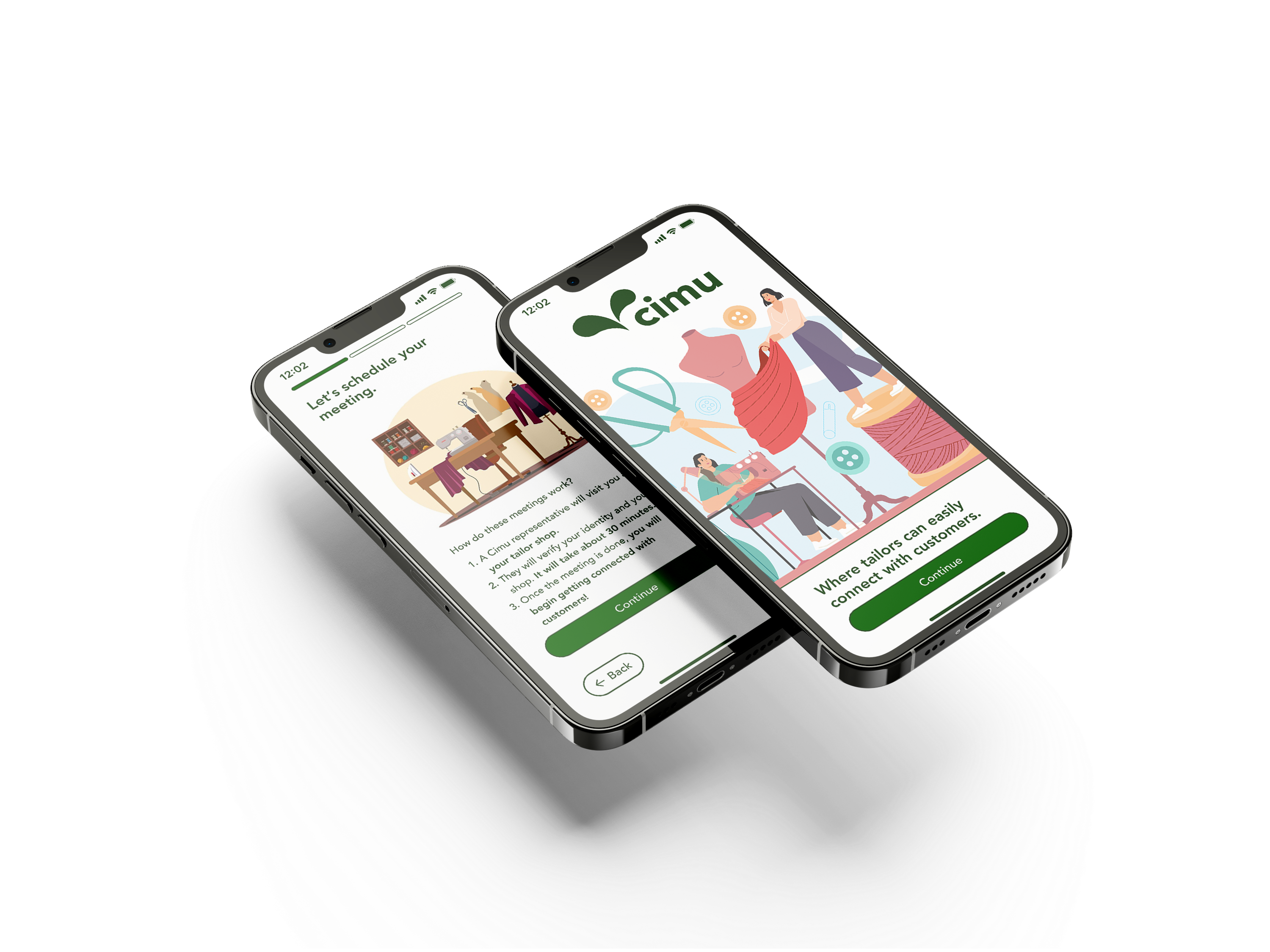
Welcome to Cimu.
01: Summary
A Journey Through Cimu

Cimu connects shoppers to tailors so that they can get their clothes easily altered to fit, instead of having to return them. Here’s how that process works:

Customer Schedules Through Online Store
Say you’re shopping at Uniqlo, and you go to checkout. A pop-up during checkout offers you an option to schedule a tailoring appointment through Cimu. This saves you the trouble of having to find and call a tailor shop and manually schedule an appointment. And you don’t even need to download anything!

Tailor Confirms Appointment via Cimu App
The tailor now sees your Uniqlo tailoring request and confirms the appointment. They do this on a specific tailor-facing Cimu app, which is where my team comes in.

Customer Meets Tailor
After the tailor confirms the appointment, you can go to the local tailor shop at the set time to get your clothes measured and ready to be altered.
Pickup
Once the tailor is done with the alterations, you’re sent a notification to pick up your clothes!
The idea is that shoppers won’t even need to have a Cimu account, they can just use it through their online shop and get sent notifications accordingly. However, we needed to design an app for tailors, so that they can manage all incoming appointments. With this in mind, I got to work coming up with an onboarding process.
Account Creation
Ultimately, I split the process into 5 steps:

STEP 01
Create Account
Short and sweet, to reduce the chances of a user getting overwhelmed and closing the app before even creating their account.
A sliding pop-up serves as a transition point from account creation to the account verification steps that users will have to follow.

STEP 02
Register Shop
If users don’t have a shop, they can enter in the address and name from scratch.

Or, if their shop is already present in the Cimu system, they can just confirm the information and move on.

STEP 03
Setting a Schedule
Tailors set their weekly availabilities.

STEP 04
Choosing Specialties
This helps make sure that Cimu creates optimal customer-tailor pairings.

STEP 05
Schedule Verification Meeting
Finally, users can schedule a meeting for a Cimu representative to verify them in-person.

ASIDE: EDITING INFORMATION
It’s also easy for users to quickly edit their information, in case they realized they entered something incorrectly.
QUICK AND SIMPLE VERIFICATION
After Cimu verifies the user during the meeting, they will get a notification that their account is verified and they’re ready to start receiving appointments from customers.

ASIDE: LOGGING IN
Automatic Redirection
If a user already has an account, Cimu will automatically redirect them to the log in page.

Users can also choose to login with their password if they desire.

↓ Scroll down to read more about my process
02: UNDERSTANDING TAILORS


Tailor shops in the New Haven area.
Tailor Demographics
After being brought onto this project, I did a deep dive into tailor demographics to understand how to best customize our app to fit their needs. I also stopped by a couple local tailor shops to meet local tailors to gather qualitative data about their shops and how they worked. Here are the major findings:

Limited English Proficiency (LEP)
Over 50% are people of color, many of whom are immigrants.
Older Audience
Over 85% of tailors are over 40 years old, with the average age of tailors being roughly 50-55.
Appointment books and phone calls
Many tailors still use appointment books and paper documents to keep track of everything.Meeting Tailor’s Needs
To design an onboarding process--and a general design system-- for Cimu, I had to make sure that it would be easy for older users with limited English proficiency, since that would be a sizable portion of the user base.
First, I ran some audits of onboarding processes on various apps: either ones that had a significant portion of older users, or ones that were structured similarly to Cimu.

I also audited various social media platforms, such as Facebook and WhatsApp.
03: DESIGN GOALS
Accessibility First
After conducting some additional research on good UX practices for older and LEP users, I came up with four major goals.

High Contrast
Many older users may have impaired vision, meaning larger font sizes and more distinct color contrasts.Accessible Diction
I tried to avoid phrases that LEP users may struggle to understand, such as “jump back in.Simple and Consistent
Use very standard UI layouts with very little complexity. Oftentimes, older users need pointers as to what is an interactive element. I tried to use the onboarding process as a “tutorial” for what interactive elements vs. non-interactive elements would look like.
Easy to Manage
This one is kind of broad, but I wanted to ensure that tailors could use the app in conjunction with their phone-and-paper bookings, to avoid double bookings and awkward cancellations.04: DESIGN SYSTEM
Adapting Cimu’s Brand
Cimu’s CEO provided us with a very detailed brand kit, which gave us a strong starting point to build our app designs from. However, as I began creating high-fidelity mockups, I realized that some tweaks had to be made in order to maintain accessibility.

Colors
Cimu had a very wide range of colors to choose from to create a design system for our app.
However, many colors had poor contrast or were simply too saturated and strained the eyes. I altered the colors accordingly to fix those issues.
Fonts
Cimu had two fonts: Halogen and Avenir. However, Halogen was too wide and unreadable for us to implement in any meaningful way, so we decided not to include it.


Components
We decided that all interactive elements should have strokes to them.
Moreover, buttons are fully rounded to separate them from other components (unless it severely impacts space, such as in the “Date” component).
Margins
Margins were relatively standard, with a 12-px spacing between most components, except for select interactions where it was necessary to include more/less spacing. This would allow elements to be easily clickable, especially for older audiences that may struggle with tapping the screen accurately.

05: FLOW
Fast, User-Friendly Onboarding

Flow proposal for Cimu.
I wanted it to be as fast as possible for people set up their accounts. Taking inspiration from other successful apps (such as Uber) I split the process up into two steps:

Create an Account
This would be as fast as possible, so users would have an account ready to go.
Verify Your Account
This would have processes that may take longer to complete, such as scheduling a verification meeting and setting hours.This way, I reduce the chance of users not even creating an account in the first place. And once a user has an account created, they’re more incentivized to take the steps to verify it. It’s a win-win!
Designing for Scalability
Having a very modular account setup process allows Cimu to add in new verification methods or additional steps to the login process as they see fit without having to overhaul the entire account creation process. While I was designing primarily for an MVP, I wanted to make sure that as their app expanded, new features would be easy to integrate into the current system.
06: VISUAL DESIGN
Low to High Fidelity
During my first week contracted, I created dozens upon dozens of low fidelity mockups to figure out how to map key information onto each page. Here are some low fidelity iterations next to their high fidelity counterparts:

Splitting Processes Across Multiple Screens
I also continued to split up information amongst the pages, to continue to try to achieve maximum simplicity in terms of instructions. Throwing all of the information on one long form overwhelmed users, especially older ones that were less technologically adept.


Why A Progress Bar?
During preliminary testing, I found that users often believed that the account creation process was going to be a much longer process than what it actually ended up being. I opted to include the progress bar to help show users that the sign-up process was only three steps long, incentivizing them to make an account.
07: Iterative Design Challenges
Simplifying Interfaces
Considering that I was designing for older, LEP users, I spent a lot of time on distilling the user interface into its simplest form. Below are some of the more interesting challenges that I faced while designing for Cimu.
Setting Schedules
Finding the perfect interaction for setting the hours was a major challenge for me. I wanted it to be possible for tailors to set a more complex schedule with breaks included.

Iteration 1: I started with a “when2meet” inspired idea, which was a major fail. It was unintuitive, took forever to enter in, and was just overall impossible to properly use.

Iteration 2: Afterwards, I tried a horizontal scrolling option. This felt a lot more intuitive, but I felt there was still an inefficient use of space.

Iteration 3: I tried laying the days out vertically, which allowed me to harness the empty space on the page.

Iteration 4: I then auto-filled a default 9-to-5 schedule into the days, so that tailors would see an “example” of how entering hours would work.
Final Iteration: Focusing on making the previous iterations easier to use.
Finally, I returned back to those most goals of accessibility and simplicity. I made the buttons larger to make it easier for users to select the correct times, and added a dropdown arrow with a time picker to hint that these “times” were editable. This made the page much easier to use and to understand. Overall, I’d call the final design a success!
Password Completion
From personal experience (my mom), older tech users are not super great at setting passwords. With this in mind, I wanted to make sure the requirements for password setting were as simple and clear as possible.

Iteration 1

Iteration 2

Iteration 3

Final Iteration
While all of my changes to the page were quite subtle, I got feedback on the third iteration that the “Must contain” box looked too much like a multiple choice box. I also realized that the design of the section broke the design system rules that I’d set for the project.
After testing out various different symbols for the “unsatisfied requirement” state, I settled with the X symbol above. That way, the starting screen wouldn’t look like an error state, but other incomplete states would communicate there were still requirements that were not met.
08: FINAL DELIVERABLES

By the end of job, I had created over 150 different low- and hi-fi frames, built a design system, and organized the prototypes shown in the beginning of this case study.
09: TAKEAWAYS
Lessons I Learned
Functionality First
My greatest area of strength is in visual/graphic design, so this project helped me hone my ability to create consistent and understandable flows. Oftentimes, flashy UI can appear to mask bad functionality, but eventually, the flaws will always poke holes through the final product.
For this project, I first worked on first understanding the tailors I was designing for and building a comprehensive lo-fi system before throwing any colors or pretty visuals into the design.
Stay Organized!
At first, I had all my designs thrown across a horribly messy Figma file. After I realized how difficult it was for others to go through to find my “Password final final FINAL” mockup, I worked on organizing everything into simple sections with explicit names. And honestly, it helped me as much as it helped the rest of the team.
Be Thorough
I learned the hard way to NOT leave my designs open to interpretation, but rather be as thorough and explicit as I could to avoid handoff mix-ups.10: Future
Next Steps
I would want to test this app on a larger scale with more tailors, especially a fully developed version. With only a few interviews to truly go off of, this project felt a little bit like I was designing in a void. Being able to truly see how many different people interact with the system I designed would not only verify that the process worked, but would allow me to continue improving the app.
Next Project →